PHOTO LINKS (Hockney)

For this brief we were asked to use the work of Hockney to inspire us to create a piece of work in a group of three that expresses a journey or collaboration to take our photos. I teamed up with Callum and George who became our model for this shoot. So we went a small trek around the building to find a prop or area we could use to express our journey. We came to this room which contained two ladders which had writing on the wall. So our idea was to use show the journey of George climbing up and down the ladder writing this message on the wall but using the photo links. So we took photos of him climbing up and down the ladder from one angle, once we traded the image we decided to go our own ways to create our individual version to then take back to show and see which one to take forward which then we decided to carry on with my version. My method was to start on a plain canvas then begin constructing the journey by using different images taken at different times, then forming it into one image of a single moment. So you see a moment but actually gives you more of an insight to the journey. Here is my process of the image  and the last large image is the out come….


SERIES IMAGES MARK 2

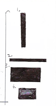
So. For this task we were given near enough the same project but this time I had been given specific sizes to keep to, so again I chose Architecture but Sculpture as my second subject. Here is the list of sizes we were given…

SIZES:

25-175mm/portait

280-40mm/landscape

100-55mm/portait

55-40mm/landscape

What I decided to do was to turn it into centimetres so I could draw out the shapes so I would know what kind of photos I could take and what to consider when taking my images…

78u

MY SKETCHES 

I now decided where I would take my images and did some research online so I came to the decision to do my photo session in the Cardiff Museum due to the great architecture features in the main areas. They have a fine collection of sculptures which can make great photo to experiment with in photoshop.

Once I had my photos from my session I decided how I should approach using photoshop on them. My method was ‘giving more by less’ just simplifying the image so I didn’t loose the original image by chucking too much at it. I started by turning the images into grey scale then applying duotone, then using white as a base colour for both series, then I chose different colours starting with architecture choosing a duller blue which seemed a nice touch but it was missing the texture in the photo so I decided to use the invert tool on the series, which then really brought the textures in each photo for architecture which I think then made a nice series. Now moving on to the sculpture series I approached it the same starting with where I had the white base colour but looking at the sculpture photos. Taking in account that the sculptures have a proud history of strong looking men.I decided to use a older looking type of red which in Roman times, red showed power so this was the reason for my choice of colour. I looked at the outcomes but felt it was to standard for my liking so I experimented with layers and opacity on each photo which I think gave the photo or canvas of the image much more to it and had more to consider. Here are the out comes for both series….

SCULPTURE

This slideshow requires JavaScript.


ARCHITECURE

This slideshow requires JavaScript.

brother-portaitTodays task was to create a portrait of someone of your choosing  and create a frame using something they use or are fond of. So for my choice I decided to use my brother who is interested in computer science, he is usually at his desk so I decided to take a picture of his desk top and placed it into photoshop and decided to start from scratch and take sections of the image that I liked and constructed the pattern on the page which I placed the portrait on top… this is the outcome…

PHOTO SERIES

Today I was asked to pick a subject that was to promote a course in a flyer form. We were asked to go out and capture four or more images of our subject, to then take back and edit them in photoshop to create a series of professional photos. The idea was to take good quality photos and edit them to create the feel that the course was well managed and had a professional feel to it. For my subject I decided to choose Architecture, for my photos I had to stay within the university grounds and so I decided to use the architectural features of the university (Cardiff Metropolitan school of Art). I explored most the building looking through rooms and hallways taking photos of architectural feature designs that I thought was interesting and had good value. Through my journey I found out how nice the building was and all its great features I even learnt about couple of facts about the building and how it was built. After I had about 40 photos and narrowed them down to just four, I then took them into photoshop and due to Ray saying “in their self they are great photos, be a shame to ruin them” I decided to keep my editing short and decided to turn it into greyscale and play with contrast and brightness. This is now my finished series…

architect-series-1


After further talk with Ray I then came to understand that Ray would like to see much more experimental side to my work; which sitting down with him, he showed me some new techniques that could be used in photoshop to create much more exciting colourful out comes and show a greater understanding of imagery and how it can be altered. Here is a outcome that after been shown I created later….

hard-mix

Here you can see we layered two images on top of each other turning one image black and white and placing another image on top which was red and white and lowering the opacity. I then went on to play with the screens that photoshop offers and finally used hard mix screen which made this nice screen print screen effect. I would like to use this kind of technique in the project to come with Ray.

SCREEN PRINTING

Screen printing is a printing technique that was introduced in the 1920’s and involves just a screen mesh and a rubber blade called a squeegee.

better summed up by this website: http://www.tate.org.uk/learn/online-resources/glossary/s/screenprint

The non-printing areas on the fabric are blocked out by a stencil. This can be created by painting on glue or lacquer, by applying adhesive film or paper, or painting a light-sensitive resist onto the screen which is then developed as a photograph (photo-screenprint), ink or paint and is then forced through the (non-blocked areas of) open fabric with a rubber blade, known as a squeegee, onto the paper.

Screen printing has been used commercially since the 1920s. It first began to be used by artists in 1930s America and the term ‘serigraph’ was initially used to denote an artist’s print; as opposed to commercial work, it has been widely used by artists as a printmaking technique since the 1950s.

The term ‘silkscreen’ (silk was originally used for the mesh) is also commonly used to describe the technique, particularly in America.

MY TASK:

Was to select an image and place it into photoshop to then turn it in to a A4 black and white image, that I would later use in my print session. Here is the image I have chosen…..

route-66

As you can see it’s a sign from the famous route 66 from America, but I chose this image not because of the design but because it was interesting due to the scruffy undertone caused by the rust from ageing. So for my design I typically wanted to get that effect in my print of the rust, so I made the first stencil simply the shape of the sign then for my second stencil I used the technique where I would use tracing paper, ink and a brush on the the service to try get the effect of the wear of the sign on the tracing paper. Once the ink was dry I then took my tracing paper with the design on it and put it in the machine that transferred my design on to the screen to make another stencil. Once done and dried I then chose a colour that suited my first print and got to work, so I did a couple on their own and played around with composition of both prints to see what out comes I would get and how I  can expand the experience of screen print. I learnt at first its a bit time consuming doing the set up process, but once done you can produce so much work at fast pace which I enjoyed seeing all the outcomes and having a small play with the composition. After all my fun, here are my strongest four….

screen-print

As you can see my progression starting simple then gradually getting more experimental  with my composition and of the two prints together which I think were effective, by screen printing I learnt some brief history on colours and why these colour wheels were produced by Nigel which was fascinating. I would like to learn more on colour theory as I do enjoy experimenting with a two colour pallet some times to see what colours are effective with each other. Over all I did enjoy my experience and would definitely like to come back and revisit screen printing.

Explicit and Implicit Imagery

Today we learnt about what explicit and implicit imagery is all about, starting with explicit. Explicit is where it is clearly stated and seen, it has no trick to it and is there in front of you to see. Inexplicit is where it is trying to convey a meaning to you. Basically you have to look and read into the meaning of the image, it engages the viewer to think and construct the meaning.

For are task we was put into pairs which we then had to create two portraits of each other one that was explicit and one that was implicit, we had to speak and learn about each others characteristics and try portray that in are two portraits of each other.

So my characteristics was that I was not really excited by anything, never really follow a plan. I am really care free and go with the flow as for Maris she was optimistic, trust worthy and likes to have fun so here are the explicit portraits…


By doing this I did learn the values of how an image can relay information by ether being straight forward and giving the information to the viewer on a plate (inexplicit), or it can do it by making the viewer engage and construct the meaning therefore making them read into the image more (implicit).


NARRITIVE PHOTOGRAPHY

Concrete Jungle, The City of the Unexpected, Land of my Fathers and W’Exit. These were the terms that were given to us as a group to go out and research. Our task was to go out in Cardiff and show a different view of the capital, by documenting these terms within and around the city but using the techniques of photography. Here are a few of our outcomes…

This slideshow requires JavaScript.


STREET PHOTOGRAPHERS TO LOOK AT

These are some interesting street photographers that I think are very influential to street photographer and really do capture what its all about…

Chuck Jins: http://www.chuckjines.com/galleries/social-documentary/ 

screen-shot-2016-10-25-at-22-37-23

Kevin Horn: http://www.kevinhornography.com/photo/#/street/

screen-shot-2016-10-25-at-22-39-31


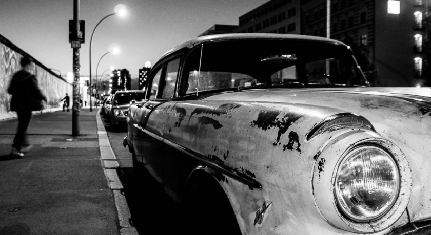
Martin Waltz: https://streetberlin.net/street-photography-berlin-2/

screen-shot-2016-10-25-at-22-42-19

HOWARD KINGSNORTH

Screen Shot 2016-10-25 at 22.19.40.png

Kingsnorth is an advertising photographer with his own very distinctive style. He has learned the techniques and crafts of his practice and knows how to produce new inventive outcomes in his work. He has worked in all aspects of advertising with photography but now has turned his attention to focus on more aerial photography which you can see in some of his great new work.  I enjoyed looking through his work and having a glimpse through his amazing vision and recognisable style. He really does have some great imagery, here is the link to his website: http://www.howardkingsnorth.com/urban-photography/d41qskgnhg04jql3uixuetqjxzog1d